Do you remember what you were doing on October 27 2016? I do. It was the day we launched our new Faculty of Engineering & Design web pages. This made us the first of the four faculties/school to publish its section on the new Bath website (sorry Science).
The ease with which our pages went live was testament to the months of preparation and hard work put in by Beth and me in our team, my fellow editors from other faculties and the digital team. Since then, we’ve taken every opportunity to spread the word about our new pages and encourage feedback. So far the response has been positive and it’s proven a good opportunity to discuss the thinking behind the new look.
Reasons to be cheerful
Some people I've shown the new pages to have looked a bit shocked at how different the new design is to the old site. But there are good reasons for this.
Responsive design
All our new pages adapt to the size of the screen they are displayed on. If you've ever tried to look at our old pages on your mobile, you’ll recall the good old squint and pinch action required to change the view from silly to sensible size. A bit of delving into analytics shows that people are using different devices to view our pages more each year. In 2011, 3.66% of users were accessing our engineering pages from a mobile device. This figure has risen year on year to 17.82% for 2016. So making our web pages responsive reacts to the shift in how people use the internet. It puts our users and their experience first. It also neatly coincides with Google's work last year that saw new search algorithms rolled out to boost rankings for mobile-friendly sites.
Clean design
An uncluttered page makes for a better user experience. It's easier on the eye and allows visitors to scan for salient content. It also addresses the design preferences of our core audiences. User research by the Nielsen Norman Group suggests that young adults prefer minimalist and flat designs as they let them scan content quicker.
Accessibility
Tim Berners-Lee, inventor of the World Wide Web, once said:
"The power of the Web is in its universality. Access by everyone regardless of disability is an essential aspect."
Our design and content choices are made with W3C's Web Content Accessibility Guidelines in mind. This means we're trying to make sure that everyone using our pages can get to all the information they need. This echoes something especially important to me: our values and duty as a university to promote inclusivity, equality and diversity.
Content driven
Finally, something I can take some credit for! With clean designs and an easy-to-use content publisher, we can focus on producing quality content that people want to read.
What's in the box?
So I’ve talked about what you see when you access our pages but not so much about what we (editors, authors, contributors) see when we input content. The new content publisher replaces OpenCMS as our content management system. If, like me, you've had the pleasure of using OpenCMS, you probably won't be too sad to say goodbye to it. You may miss me apologising to you for what I've often optimistically called its 'random quirks'. But maybe not too much.
My favourite bits
Structured content. There are 12 content types in the content publisher. Every time we create a page, we choose an appropriate template to match the content e.g. project, event, case study or announcement. The beauty of these templates is that they are straightforward and easy to use with a clear purpose that focuses on the user need. We also use markdown so there is minimal formatting needed.
No more broken code! The way the templates are built means that you can't accidentally break any HTML, which was a recurring problem for users in OpenCMS. The time I would have spent seeking out and fixing rogue divs can now be better spent working with subject matter experts (you lot) to craft engaging content.

Empowerment and education. Because the content publisher is easy to use, it's also easier to train people. This helps us devolve responsibilities and roll out access to more users. It also means we can focus on the important stuff; namely, good content! We can spend more time looking at how to write better content as well as share skills and best practice. We already have clearer guides on:
My hope is that this new approach to web content will ignite a positive culture shift to more collaborative working between requesters and creators.
But how did we get here?
In September 2015, Beth and I spent a week in Digital Basecamp working on transitioning Faculty content. We had already audited all our existing pages and chosen an action (e.g. major edit, split, merge, archive) for each page. At this stage, it was decided that recruitment content would remain out of scope until the new 'course search' app was built. This is why you can still see our old Graduate School pages.
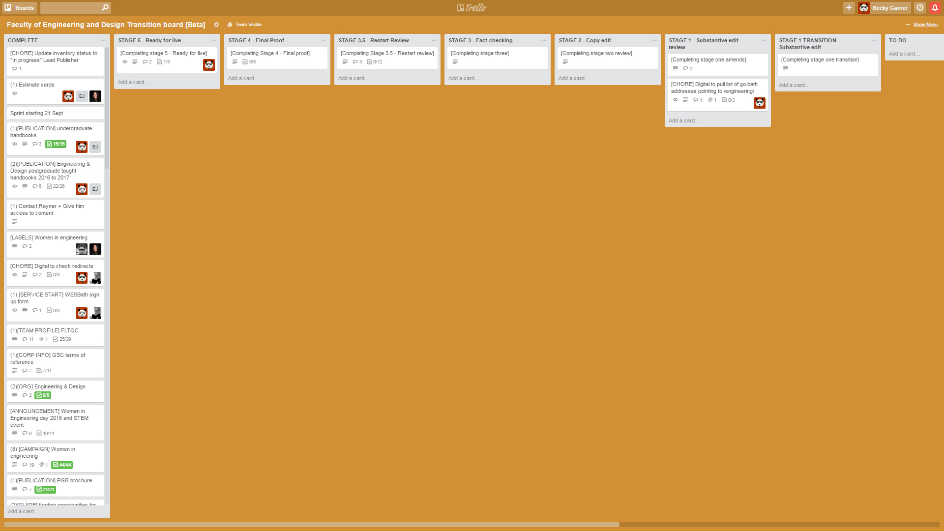
We wrote user needs for all the content we wanted to transition and assigned them a content type. We used Trello to track the progress of the sprint. We created cards for each piece of content to transition and ranked it in terms of difficulty using the Fibonacci sequence. Each piece had to go through a series of editing, reviewing, fact-checking and proofing before it reached the 'ready for live' stage.
During the sprint and in the following weeks, we transitioned the agreed existing Faculty content as well as creating some new. So we were ready to publish, right? Wrong. Transition came to a halt for reasons beyond our control and probably best not to dwell on now.
Skip to a year later and we were back in Digital Basecamp reviving the Trello board and dusting off our not-so-new content. The problem with time is that it keeps changing things. We couldn't simply publish the content that we'd created the year before because a lot of it was now out of date. We spent another week and a half reviewing, updating and creating content before I could rejoice in the fact that we were ready for final sign off. And that brings us back round to 27 October 2016 when I celebrated launching our new pages by making a plastic dragon roar.
I'm not going to lie; at times, transitioning this section has felt more like a marathon than a sprint. But it has been worth it. I've learnt a lot about content over the past two years: how to audit content, how to better structure and write content, and how to think about its value to our audience. These are things I want and hope to share with others.
So what next?
Although signing off the Faculty section felt momentous, we still have a way to go before we can burn OpenCMS. Four departments, a new course search app for undergraduate and postgraduate courses, and a multitude of research centres are all banging down my door. At the front of this queue is Electronic & Electrical Engineering content. We are going to spend a week in April working with Ann and Cassie to transition the department content for elec-eng. I'm confident that the work we've already put in on this and the lessons we've learnt along the way will make for a smooth transition sprint.
If you have any questions about transition, please email fed-web@bath.ac.uk. If you've seen the new faculty content and want to feedback, you'll find a 'suggest an improvement' link on the bottom right of all pages.