
If you’re in the habit of checking our course pages frequently (who isn’t?), you might have noticed some extra buttons appear in the hero section. “What do these buttons do?” I hear you ask. “Why are they here and where did they come from? Won’t someone please tell me in great detail all about their development process?”
Well, you've come to the right place.
What’s changed and why?
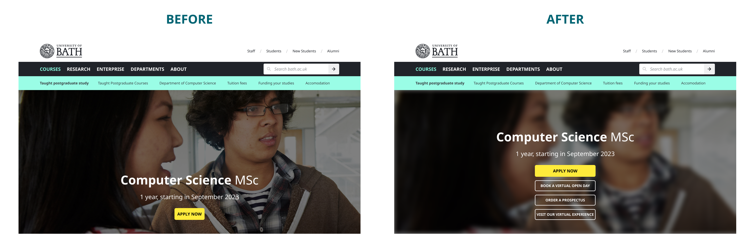
The hero sections on our course pages (that’s the large image and title at the top of the page) have always had a single call-to-action (CTA) button. For that matter, so have the hero sections on all our other pages. This is for good reason – it’s standard convention to have a single CTA associated with a screen. You offer your users a proposition, give them all the relevant information they need, then ask them to decide if they want to act on this proposition. If you can do this with a single button, that’s great as it removes ambiguity and confusion.
However, sometimes one is just not enough.
A single button offers simplicity at the expense of flexibility. Most of the time prospective students want to apply to a course or register for an open day so this was what our single CTAs did. However, sometimes they may want to order the prospectus or sign up for updates if the course isn’t accepting applicants.
Sometimes faculties run timed events like webinars or virtual experiences. With a single CTA, we have to make a choice between allowing students to apply for a course and signing up for these events from the course page.
Allowing our web editors the flexibility to offer prospective students multiple options related to the course of their choice is the driving force behind this project.
Design, development, and testing
This project was mostly concerned with functionality – offering students more options so that we can improve their experience with our course pages. Therefore, we decided that we didn’t want to introduce any radical changes to look and feel and instead stick with our current styling. However, introducing more choice can also introduce more confusion – the takeaway menu problem if you like.
When there is more than a single CTA on a screen, it’s good practice to indicate to your users which is the primary action, and which are secondary, tertiary etc… To accomplish this, we chose two contrasting styles - the existing hero CTA styling for the primary action as it has a nice bright background colour which stands out against the hero image, and our ghost button styling for the secondary actions.
This style uses only a white outline and text which makes it stand out less than the primary button. However, the lack of background colour on ghost buttons does mean that they are less readable when used on top of images like the hero. To overcome this, we applied a blur filter to the hero image. This wasn’t without objection as it means that focus is taken away from the subject of the image. However, we felt that readability is more important. In time, we may well revisit this and come up with a more elegant solution.
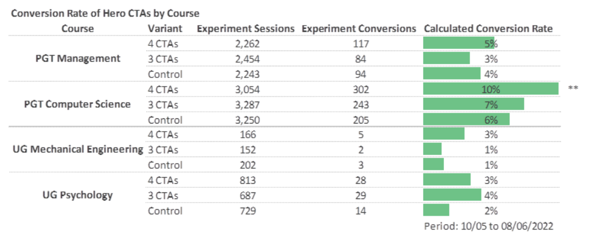
Next, we needed to find out if our new designs were feasible. As we’ve already mentioned, it’s typical to have only one CTA, so we needed to make sure that having more would not confuse users. To validate this, we created a series of A-B tests using Google Optimize, comparing variants of four different course pages, each one from a different faculty, to reduce the bias that we might get from only testing visitors to one course from one faculty.
Each variant had a different number of CTAs – one with four, another with three, and the final one with just the original single CTA which acts as the control. Optimize works by randomly assigning one of the variants to page visitors. We then record the percentage of visitors who clicked any of the hero CTAs vs those who did not.
We ran the A-B tests for a month, and at the end of the period, it was clear that having more CTAs did not make users less likely to click one of them. In fact, the opposite seemed to be true. On two of the course pages that we tested, users were just as likely to click on a CTA if there were multiple buttons as if there were only one, and on the other two pages, they were actually more likely to click if there were multiple buttons.
In addition to the A-B test, we also carried out several remote usability tests where we gave users a series of tasks to complete as well as questions to answer. These tests confirmed what we had found in the A-B tests. However, they also shone a little light on some other areas including page length, and the in-page navigation. These were common complaints that we had heard before and are now working to improve.
The final piece of the puzzle was making changes to Typecase for Courses – our CMS for course pages. After all, what good is making these changes if we don’t allow web editors to use them?
Up until this point, hero CTAs were inserted into pages using Google Tag Manager, not exactly an optimal solution. This meant we had to develop a new user experience to allow the web editors to configure these new hero CTAs in Typecase for Courses. This was no small task and involved a lot of back-and-forth between the Dev team and our users (web editors), making sure requirements were being met.
Challenges
There were many challenges during this project, most of which were borne from the fact that we didn’t really have an existing pattern that was similar – nowhere else on the site are there groups of buttons.
Design challenges included managing up to four times the number of CTAs on mobile screens and ensuring they all fit nicely, even on smaller devices. On the front end, we had to implement logic to force all the buttons to be the same width but also be no wider than is necessary to fit the button with the longest text – a complicated way of saying that we didn’t just use a large fixed width. We also had challenges on the back end creating logic to ensure that the correct buttons are easily deployed across all courses in a given subject but that they can also be overridden by web editors at course level.
However, as is often the case, the biggest challenge was stakeholder engagement. It takes time to get the right people in the room together (physically or digitally) and it also takes time and effort to tease the requirements out of stakeholders, especially on a project that involves unfamiliar elements. During the design phase, there was a certain amount of rework due to misunderstanding some of the requirements, as well as others that only became obvious once the stakeholders had designs and test data to look at.
What did we learn?
It’s important to get buy-in early and engage with stakeholders as soon as possible. This is true of almost any project but it bears repeating. The earlier you bring people in, the more likely you are to identify pain points and other problems. Also the more of your stakeholders you engage with, the more context you will have. This will help to give you the best chance of getting the requirements right.
We also learned that assumptions are often wrong. Almost all of us thought that adding more CTAs to the hero section would make users less likely to click any of them due to more choice. Surely if there is only one button to click then users are more likely to click it? Well not if that button doesn’t let a user do what they came to the page for. We can’t always predict what users want and sometimes a little more choice is no bad thing.
What’s next?
This work was very much part of a larger suite of improvements that we want to make to our course pages and there is still much to do. We will be making improvements to the way that our in-page navigation works as well as doing discovery work on including a helpful summary section which will give users a quick snapshot of key course information.
As for this project, we will continue to monitor the performance of the new hero CTAs to make sure we get the messaging right. Stuff like this should always be part of continual improvement.
Respond