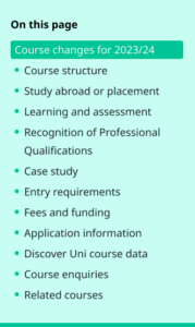
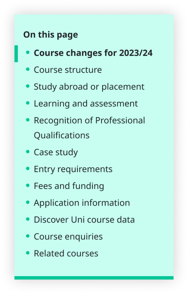
Some content types on bath.ac.uk are very information-dense and tend to be on the long side. To make navigating these pages easier, we provide a vertical in-page navigation which allows users to jump straight to the content they’re looking for. Up until recently, this was a simple, static menu that sits at the top of the page. However, we had received numerous anecdotal requests from various people asking why it didn’t ‘follow you down the page?’ So, we decided to take a look to see if we could make a persistent in-page navigation.
On paper, this seemed like a simple project. However, there were many different parts that had to be taken into consideration. To keep things simple, we wanted a single solution to work across all necessary content types. However, they don’t all have the same requirements, so we needed a flexible solution. We also had to make sure that what was implemented was fully accessible. This meant that the project went through several iterations, designers, and developers and was even put on hold at one point to allow us to rethink and come back with fresh ideas.
The first version
Our first prototype included ideas and code from work done by previous developers and UX designers from the Digital team as well as our current Front-end Developer, Rebecca. Apart from the fact it was persistent (i.e. it floated), it stayed very close to the previous static version. Font sizes and padding were the same; the navigation stayed on the right-hand side, and page content was only pushed to the side very slightly with padding.
We produced working prototypes, but it was clear to the team that this felt like a very ‘hacky’ implementation. We needed to find better ways of addressing some of the finer details, such as how long section titles and pages with lots of headings were handled.
On top of this, a lot of the code was too complex. We had added a class of ‘in-page-target' to every section to detect if it was the active section. The way we were positioning in-page content would have been difficult when it came to implementing it in Typecase – our bespoke CMS. It was clear we had more work to do.

The redesign
We decided to get some inspiration and do a little benchmarking by looking at how others tackle this particular design challenge. It turns out that in-page navigations aren’t as common as we thought, so finding good examples took some time.
But find them we did.
It became clear that most implementations had the navigation on the left of the page and the content to its right, so we decided to follow suit so as to make it as familiar as possible to users and to make the navigation fit better with the content, which is typically left-justified. This was a bigger challenge than you might think, as this meant that we had to reorganise the structure of the content on several content types, including course pages, which are hugely important to the University. Still, we knew it would be worth it for a better user experience. So we moved the in-page navigation to the left of the page and the content over to the right of it, pushing it off-centre and towards the right edge of the page to allow the navigation more room.
The next thing we needed to tackle was how we use visual cues. How do users know the navigation is persistent and how do they know which section they’re looking at? We decided to go obvious, employing a shadow under the navigation when it’s ‘floating’ to give an impression of elevation. We also wrapped the current section in a big, bright rectangle to make it very obvious to the user that this is the section they’re viewing.
Finally, we had to tackle the remaining layout challenges. Adapting components for different breakpoints is normally straightforward, but having a persistent navigation next to the page content meant we were more space-constrained than usual. We addressed this by experimenting with many different minimum and maximum width and padding values across all the different breakpoints.
In most content types, we tend to only use three breakpoints – one for mobile devices, one for tablets, and one for desktops. However, we decided to make use of our two largest breakpoints for the first time. This was to allow the content to be more centred on devices with enough width. Some desktop analytics revealed that over 65% of desktop users have monitors wide enough to support our largest breakpoint, so we decided to make the user experience better for them.
When section titles get too long, it makes the links in the navigation look a little silly. We decided to cap them at three lines. Any section titles that are longer than this in the navigation get truncated. We also employed an overflow method to accommodate pages with lots of sections. If there are more sections than can fit inside the navigation, it becomes scrollable, indicated by a prominent scroll bar, which cues users that there are more sections below the navigation’s fold.
A note on JavaScript
This extra functionality is great and all, but it relies on JavaScript. Now, we don’t exactly avoid JavaScript like it’s forbidden, but we do try to avoid relying on it wherever possible. However, it was clear that in the case of our persistent in-page navigation, this was simply not possible.
So, for users who disable JavaScript, we decided the best thing to do was to reconfigure the navigation and simply use its tried-and-true static layout.
Polishing (post-launch iteration)
You can now see the persistent in-page navigation working live on course and guide pages across the site (check out this example). We've recently moved our corporate information pages over to our modern style ‘Lens’ pages. You can now see the in-page navigation in action on these pages, where we’ve added the functionality to allow sub-headings to be picked up by the in-page navigation.
After launch, we iterated further by updating the active link state styling. Previously, the whole section title was wrapped in a prominent green rectangle. However, we had a few reports of users getting confused as they thought it looked like a button. So, we changed the active state, adding a left border and bold text.

What’s next?
It is not feasible for the current functionality to work on tablet and mobile, so on these breakpoints, the in-page navigation remains static at the top of the page.
Fear not; the mobile and tablet versions are currently a work in progress. In fact, we have recently finished carrying out user research on mobile versions, the results of which were clear and have helped us decide on a design direction. You’ll be able to see the mobile and tablet versions live on the site in the coming weeks.
Come back soon, and we will be sure to have an update with a follow-up blog post once we have launched.
Respond
