
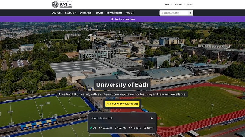
The Digital team recently launched a new University homepage, with an updated design, greater flexibility, more impactful content, and enhanced functionality including:
- a video embed for the Hero component
- a filterable search box in the Hero
- multiple takeover layouts to promote University events
This project was a huge collaborative effort, and our UX Designer, Front-end and Back-end Developers, and Content Designers all played their part in producing an impressive new front door for the University website.
UX design - Sam Street
First steps
When we were first asked to redesign the homepage, we were given a brief to address three common complaints about the existing page; its look and feel was inconsistent with the rest of the site, it lacked the ability to convey a strong message, and it had too much content and not enough user engagement.
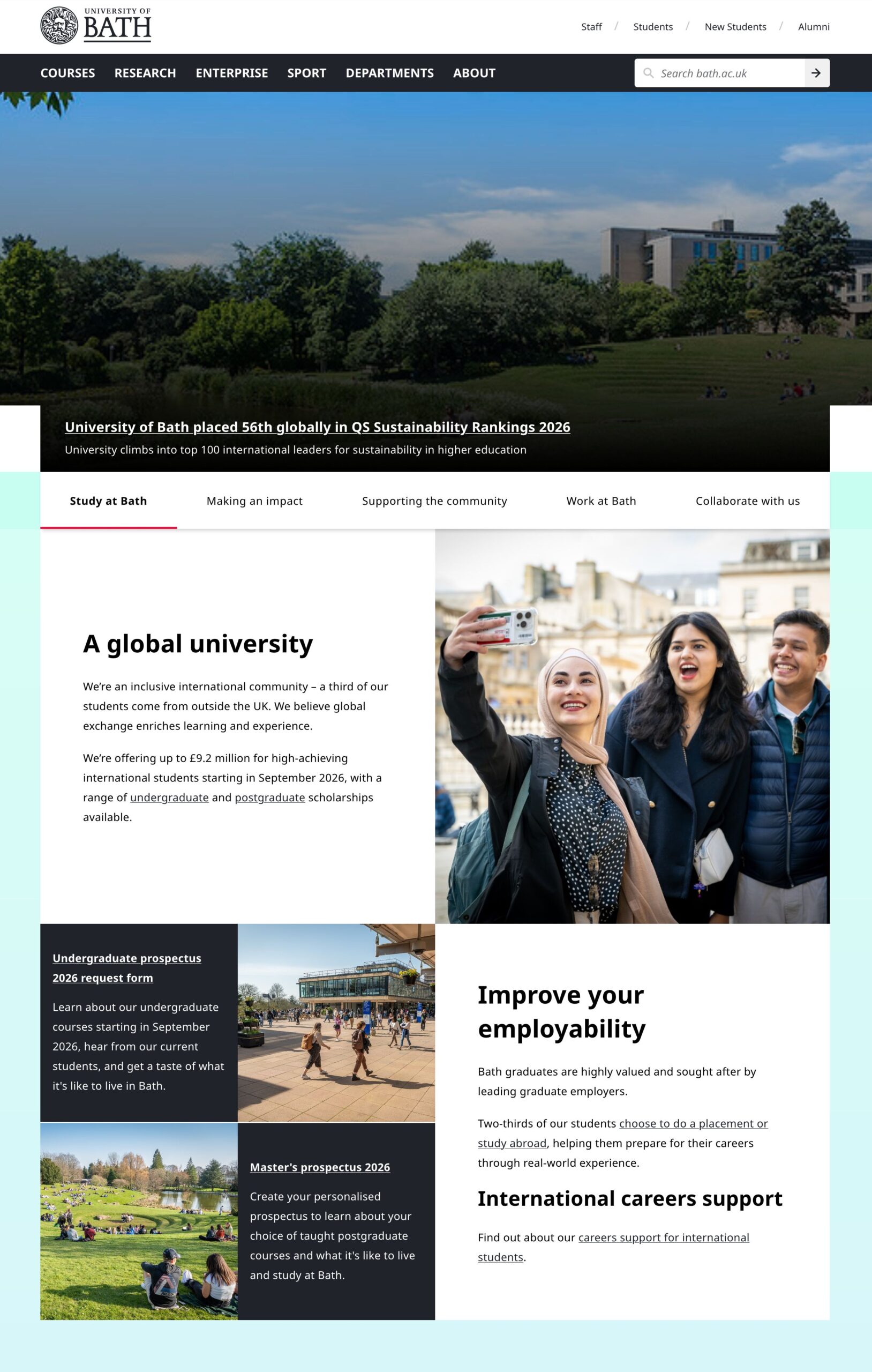
As well as addressing these problems, the new homepage needed to be:
- dynamic – introduce movement to give the page some energy
- simple – reduce the amount of content and make it easier to consume
- clear – put the messaging front and centre
We started the process with desktop research. This included looking at analytics for our audience demographics, device categories, performance metrics, and heatmapping the existing page to discover the high and low engagement regions. We also benchmarked around 30 homepages from a range of other universities.
Once we’d distilled our research down, we set about applying what we’d learned, starting with wireframe designs, before progressing to high fidelity mock-ups. By this point we had decided on a design which featured a large hero video along with a prominent search element, which was intended to make searching for courses – the primary user journey – easier. The page also featured a section signposting visitors to the three main study areas, as well as a section displaying recent research stories and a news and events section.
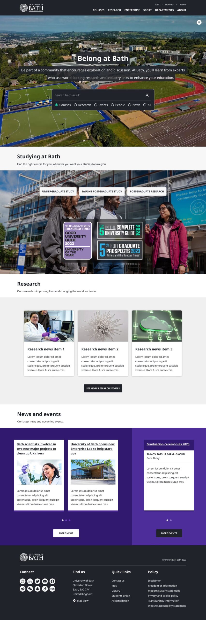
After a few design critiques, stakeholders approved of the design direction but felt that the study signposting and research sections weren’t doing much for the page. As a result, the brief was updated, asking us to incorporate messaging on why prospective students would want to choose the University of Bath. We took this on board and refined the designs. During this phase there were more critique sessions, as well as usability studies to make sure the needs of real users were being met.
Final design
Finally, we arrived at our final design. The large hero video and search remain, albeit with some extra polish, but other sections were replaced with revised versions of our split content patterns. These are a better choice when trying to convey strong messaging with striking visuals.

Front-end development - Rebecca Stewart
Front-end prototype development for the homepage began in 2023, with several iterations created to demonstrate different variations of takeover mode. Each went through multiple rounds of revision as the design evolved. The new homepage designs aligned more closely with the Lens design system than their predecessor, though a significant number of new styles still needed to be created alongside new technical considerations and modifications to existing component styles.
The new design introduced a Hero video overlaid with a title and categorised search box, something the website hadn't used before. Before prototype development began, we carried out discovery work to determine the best approach for implementing it. As the University already had a paid Vimeo account, hosting the video there was the natural choice. From there, we used the Vimeo API to add play/pause controls for accessibility, and capped playback resolution at 1080p to keep bandwidth usage and load times to a minimum. The search box was implemented using our site search provider, Funnelback, with the filters hidden on the small breakpoint for mobile users.
The news and events sections required a carousel capable of displaying cards at a uniform height, matched to the tallest card in the set, along with controls, pagination, and full accessibility support. It became clear early on that Foundation's built-in carousel wouldn't meet these requirements, so after some discovery work, we chose Swiper.js for the homepage carousels. We also added custom JavaScript to ensure consistent card heights across all device sizes.
The new homepage also introduced a redesigned header and footer. Although these were initially built for the homepage, we decided to roll them out across the whole website, which meant ensuring they worked well in all contexts.
The footer is streamlined but includes more key links than its predecessor, along with links to the University's social media accounts. To save space on mobile, we used Foundation's accordion to collapse sections. The new header follows a similar structure to the old one and retains the same content, but has been refined slightly. On the external homepage, the search bar only appears in the header when the Hero search box is not visible, avoiding duplication.
The homepage was tested against WCAG 2.2 standards using a combination of manual testing and automated tools, including ARC, Wave, and Silktide. The Hero video includes play/pause controls and respects the user's reduced motion preference, so those with reduced motion enabled will not see the video autoplay.
Back-end development - Daniel Matongo
The homepage was initially scaffolded as a standard content type but ended up needing additional functionality that extends beyond the behaviour of a standard content type. Notably, the homepage needed to have switchable layouts. This made it so that the parent page (the homepage) was no longer responsible for its children. So, the parent could now have multiple layouts, and each layout could have a different collection of children (components).
As part of this work, it was also noted that we needed to separate access to the homepage. Because of its sheer size, there was a likelihood that overlapping edits could be made or even layout switches. This would have resulted in inconsistent data across the board and issues with unapproved content going live before it was intended. To mitigate this, we introduced a new kind of compossible content type meant to exist as both a parent and as a child, we called these Content partials.
Content partials exist as a standalone content type that, unlike most content types on the website, have no fixed front-end design. Their front-end design is dependent on their subtype and whether they belong to a parent. In their other form, Content partials can have a parent.
A Content partial with a parent has no independent publishing flow and its content gets propagated upwards to its parent, however this also introduced a new problem. Content items exist in two states, published or draft, but their components are always raw in form (live from the database when previewing and when published). This was not desired. We wanted to make it so that previewing from a partial does not preview the draft changes of the parent, and vice versa. This works easily in the child-to-parent direction but terribly from parent to child because children keep no record of their last published state, so we also had to implement last published state records for these child objects.
Content Design - the Digital Content team
Learning the ropes
Once the design and development wizards had worked their magic, we were invited to start trying out the new homepage in Typecase's staging environment. At first, this meant playing around with the new features and different components to see how they worked and what kind of content could go where. After a bit of testing, though, it became apparent that we also needed to make sure we'd be able to update the page without breaking anything.
The new homepage is quite different to the other content types on the website. For a start, the new takeover mode means that there are, essentially, three or four different versions of the homepage within the one edit screen. We can switch between layouts using a drop-down menu on the edit screen, and can preview any of them we choose, but we have to be careful not to accidentally publish the wrong layout when we're making updates to the homepage. This happened a few times during testing, as we were all making edits to different layouts at the same time. Now, on the live site, we make sure nobody else is editing the homepage before we make changes or publish them.
The other difference is the aforementioned Content partials, one of which allows the Communications team to update the homepage's News section without having to republish the rest of the homepage. Without partials working the way they do, the Communications team could accidentally publish the homepage while we're building a new takeover layout, and push unfinished content onto the most visited page on the website. Although we're not responsible for the updating the News section, we needed to make sure we knew how it worked and that it wouldn't interfere with any of the rest of the homepage content.
Content time
The stakeholder brief for the homepage redesign gave us a good idea of the type of content we needed to include and, as the previous homepage was deemed a bit on the full side, what we should exclude. Based on that, we were able to draft a default layout, as well as takeover layouts for Undergraduate Open Days and Graduation Ceremonies.
The Media Production team kindly provided a couple of new video edits, based on existing footage, which we put in the Hero components for the default and Open Day layouts.
Beyond the Hero, we opted for a simple structure of two Split section groups, one about studying at Bath, and the other about research. The 'Studying at Bath' group covers the three key pillars of our student recruitment strategy:
- employability
- education
- location
When it came to writing copy for the takeover layouts, we allowed ourselves slightly more freedom than we normally would in terms of style. The idea is for the takeover layouts to go live a day or two before the event, so wanted the words to be more inviting and playful, welcoming people to the event, rather than promoting the benefits of coming or asking people to register.
Going live
With the content in place on the staging site, we were able to share the page with stakeholders, who, much to our mutual delight, signed everything off and gave us the go-ahead for the big launch. We also trained the Communications team in using the News partial, which they were very happy about given how easy it is to use.
As well as the page content, we'd written various communications to share the big news with the rest of the University. This included:
- a summary of changes for the Vice-Chancellor and the Executive team
- an email explaining the changes to the Communications team (we also ran an in-person demo for them)
- an Announcement for the Staff landing page
- a Project page on the website to explain the whole process
We shared and published these communications the week before the go-live date, and then launched the new University homepage on 26 May.
Respond

