If you’ve ever built, or even used, a design system before, you’ll be familiar with components and patterns. These are the pieces that are assembled together and make up the larger product which end users interact with.
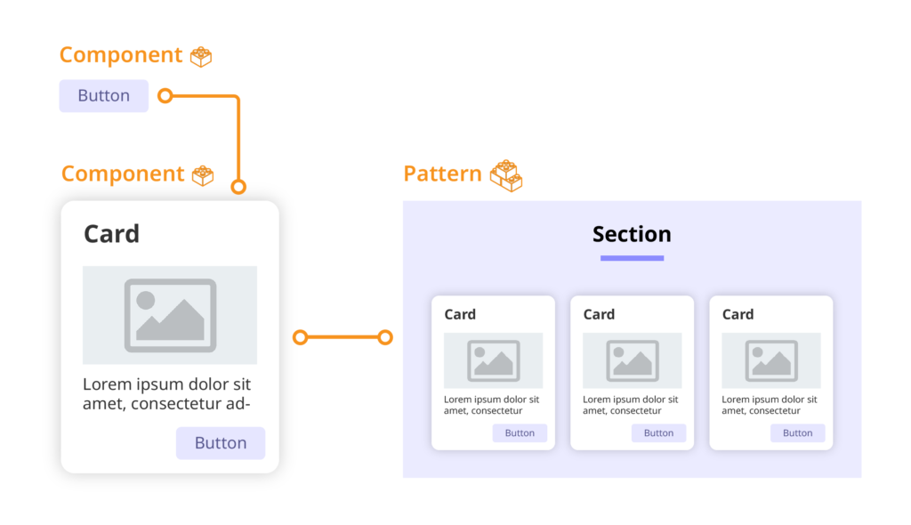
Patterns (sometimes known as contexts) are easy enough to define – they're combinations of components that make them more useful (for example a form consisting of multiple fields). Components though...much trickier. Their definition can vary quite a bit between organisations, often tailored to how their own design systems are used. Some will include very small items like icons whereas others will have large, complex items consisting of many fields, buttons and other parts and still be called a component.
In general though, a component can be thought of as a reusable part of the smallest size that is still useful in a design system. This is the approach we take in the Digital team.
Let's look at an example component, common to almost all design systems and seen on countless websites and apps - the card.
Cards are often used to show a quick snapshot of some larger content such as the headline and feature image for a news item. They usually consist of a title, an image, some copy, and often a button, all grouped nicely together, surrounded by a frame to give it a look and feel close to that of a physical card. We would think of a complete card as a component. But what about the button inside the card? Then we ask the question ‘will this button be reused in any other components?’ If the answer is yes, then this button can also be a component. If we have layouts of multiple cards grouped together that often get used on page layouts, then we can classify this as a pattern.

So what’s wrong with 'components' and 'patterns'?
Language varies between different design systems. Some use the atomic design framework where you have atoms, molecules, organisms etc... others use analogies like parts and assemblies. However, the components and patterns paradigm is by far the most common. So why do we have to be different? As much as we are pioneering trail blazers on the Digital team, the real reason is conflicting language.
At the University of Bath, we have our own in-house CMS called Typecase which the Digital Development team maintains. Typecase is used to publish almost all the content on bath.ac.uk. The user experience enables users to add various patterns to pages such as groups of news items, case study sections, infographics and many more. However, Typecase refers to all of these as components.
Let's be clear, there was a good reason for this - different kinds of users have different needs, and when Typecase was being developed, it was felt that grouping all the different patterns and components together and referring to all of them simply as 'components' would be less confusing for the users.
However, users of our design system, such as designers and front-end developers, have different needs and, more importantly, different expectations. When new people join the team in these roles, they come in with expectations of what a design system should look like and it's important to use terminology which is consistent with how design systems work elsewhere.
It's important to balance the needs of both these user groups - it's good to use language which is consistent with industry conventions, but it's also important to make sure things are easy to understand for our Typecase users. If we were to change the language inside Typecase, we would need to retrain hundreds of users.
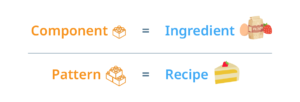
So our solution was to use different terminology in our design system documentation, opting for an analogy based on food. In place of components, we use ingredients. In place of patterns/contexts, we use recipes. Simple right?

Why food?
The fact that we've had more than one meeting where we discussed possible alternatives should tell you that it's not easy coming up with suitable terminology. The words we use need to convey the same basic meaning as components and patterns – a word that is easily understood as a small, reusable unit, and another word to represent a collection of these units that is something bigger than the sum of its parts.
Some of the other candidates were atoms and molecules (a nod to atomic design principles), or parts and assemblies. The problem is that neither of these sat right with the team. They also felt a little too perfunctory, maybe even a little soulless.
At some point, someone had a spark of inspiration and suggested food as a metaphor, hence ingredients and recipes. It may not be a perfect analogy but the team loved it and sometimes that matters more – getting everyone to buy into this kind of thing is important. It helps that we all have a love of food, but more than that, the idea of food and cooking tends to conjure up the feeling of making something with love and care, something that people enjoy.
Did it work?
Only time will tell, but if the first couple of months are anything to go by, then this metaphor may stick around. It’s taken a little effort to get the team to refer to components as ingredients and patterns/contexts as recipes but it’s gradually taking hold. We’re still at that early stage when we’re in meetings and one of us pauses for a moment to make sure we use the correct terminology and everyone else has a knowing smile. The fact that we’re having fun with it is probably a good indication of its staying power.
We’ll see what we cook up next…
Respond

