This case study was written by Clare Baxter (Instructional Designer) in conversation with Clare Woolfe, Naomi Farrington and Helen Friend from the International Relations team.
Background Context
An original trio of Exchange Moodle pages were organised in an illogical way, unattractive and difficult for students to navigate. Besides being almost identical in appearance and design, the three different exchange courses shared a lot of the same information which meant the team managing and maintaining them were always having to update all three courses.
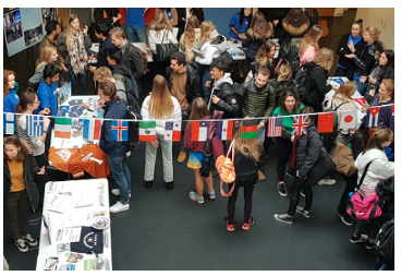
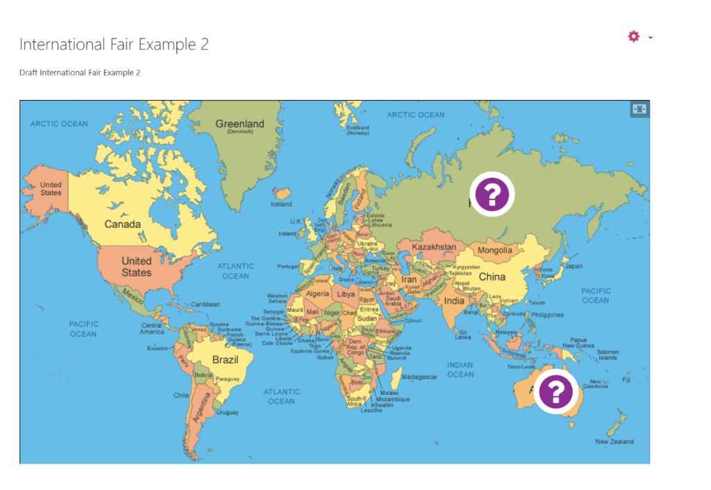
In addition to the administrative inefficiency of running the pages in this way, each year the International Relations team hold an ‘International Fair’. This is usually an in-person event where students visit stands representing different countries and institutions (see image below).
Running an in-person event on campus this year wasn’t feasible due to the ongoing Covid-19 situation, therefore another challenge was creating a virtual space within Moodle to replicate this event.
Purpose
To produce one course for all three programmes with a clear story of the Academic Exchange from start to finish. Resources to be accessible for students and easy for the International Relations team to update.
Approach
1. Different possibilities investigated
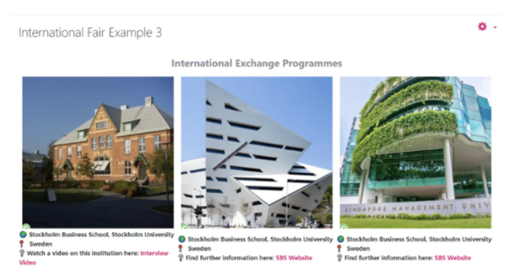
The International Relations team worked closely with Clare Baxter, an Instructional Designer in the Technology Enhanced Learning (TEL) team, to learn about the possibility of consolidating the pages for three cohorts into one overarching page. In order for this to be purposeful and effective, the new course would need common sections containing information relevant for all students (presentations/briefings, money matters, health and safety, well being, grants and funding), as well as individual sections for each cohort with their own unique information (relevant exchange partners, video recordings, application forms, end of exchange reports, pre-approved lists of units).
An entirely new page was created and content from the three original cohorts was imported and organised into hidden sections for the team to sort through to decide on a better way to create a ‘narrative’ for students to follow as they explored the possibility – and reality of – an international exchange.
From there, the team decided on key information to be presented on the ‘homepage’ of the new page, as follows:
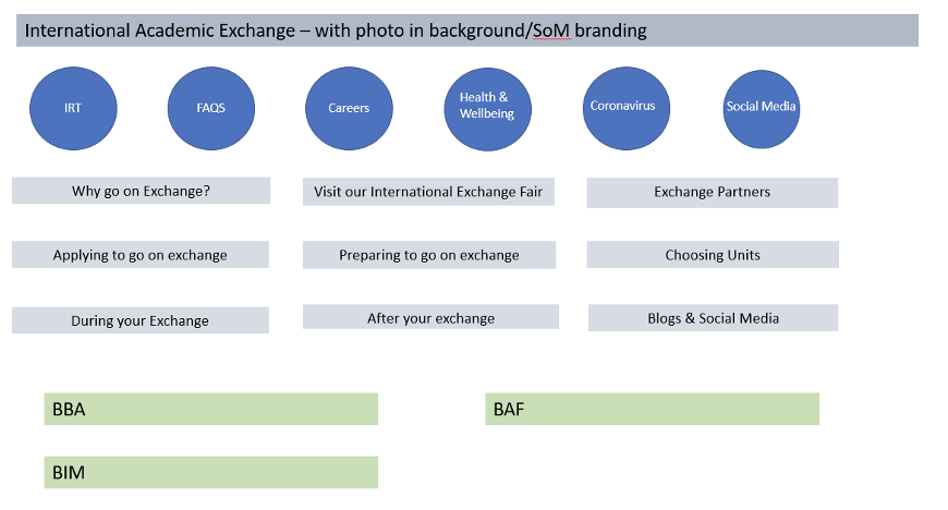
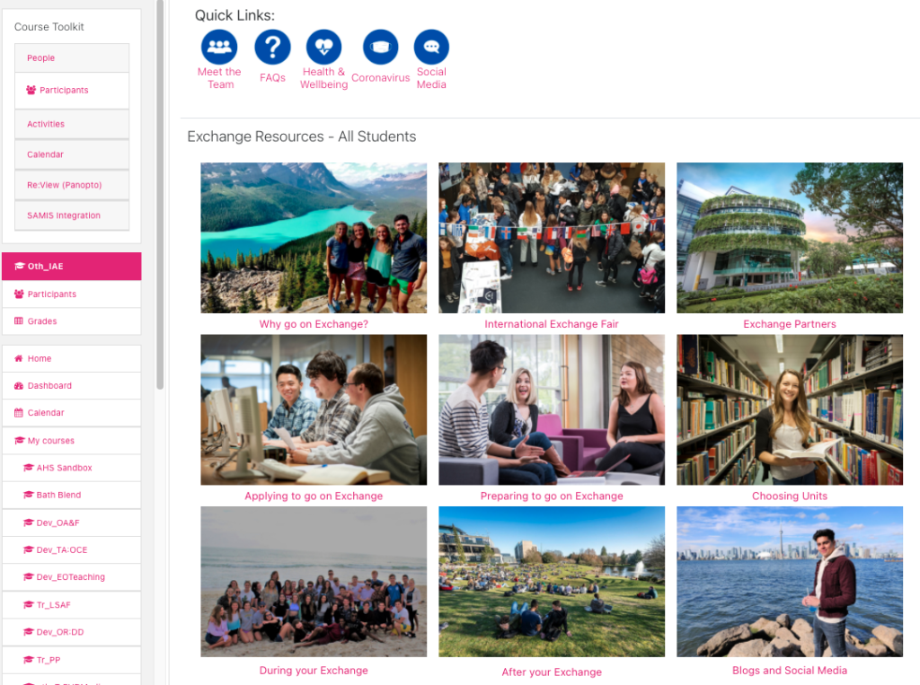
To make this plan a reality, tables in Moodle were used to create a grid of images, which hyperlinked to pages on each of the desired topics, using the imported files and activities from the old pages where necessary.
2. The requirement of a virtual fair
Prior to COVID, an ‘International Exchange Fair’ was held for prospective exchange students (mostly second year students). This was held in a large room with several stands that represented the partner universities. The stands were manned by students who had previously been out on exchange. This needed to be replicated virtually. Initially, the team thought there could be a section for each of the cohorts, with links to videos with former exchange students, but after some experimenting and mock-up designs (see several of these below), it was decided a hub page directing students to the partners via location would be a better experience for users.
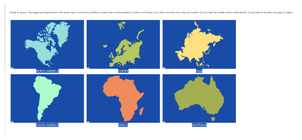
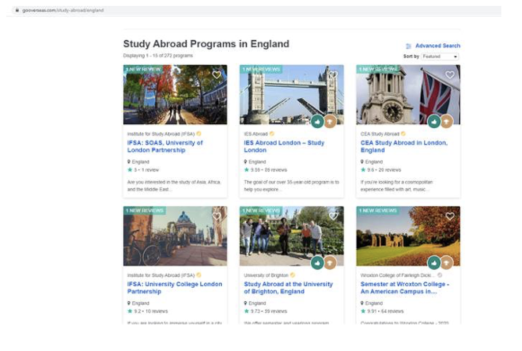
The final option was created as a result of the pages cited as inspiration: Sydney’s web pages, the IES website, and the screenshot below from the ‘Go Overseas’ website:
3. Use of Multimedia and TEL Tools
As well as using the formatting features that already exist within Moodle, images, videos and other tools were used to enhance the experience of users as they visit and explore the pages. For example, a Sway is embedded within the first page for students to read about why they might go on exchange:
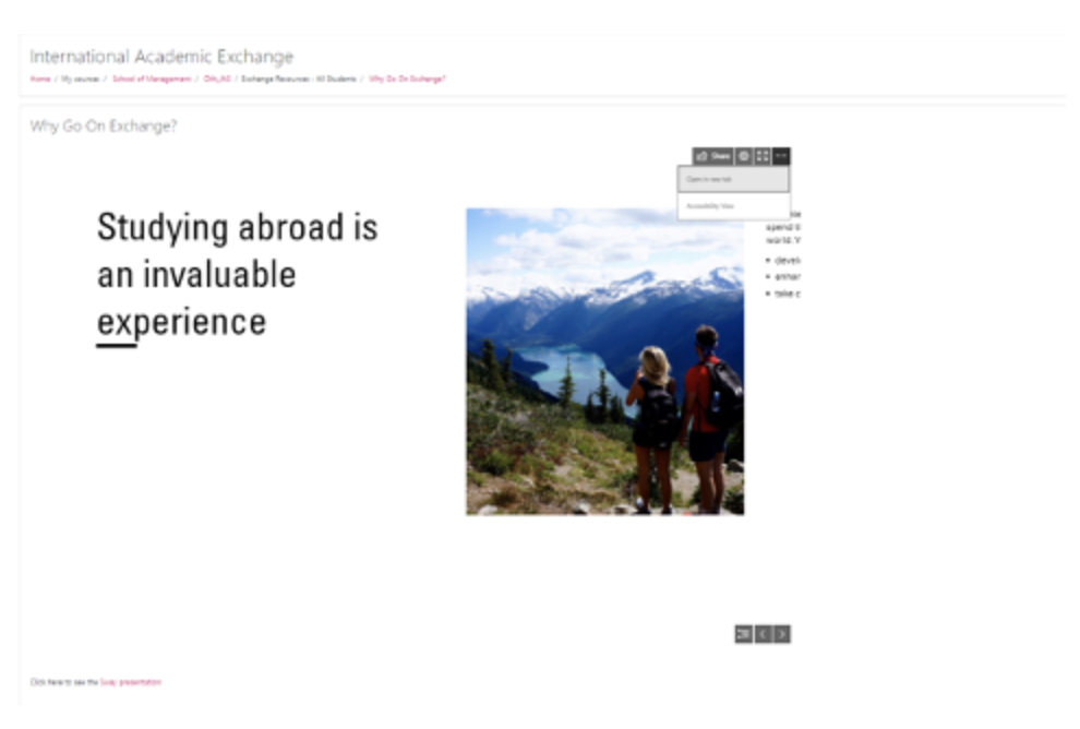
Students can navigate through the text and images included in the Sway from within Moodle, and there are options to open it in a new tab, make it full screen or to open an accessible version.
4. Accessibility
It was crucial to ensure that all the new features and elements on the course were digitally accessible. As well as sharing instructions on how to access the Blackboard Ally report, all tables were tested using a screen reader extension, alt text was added to all images, and the University of Brighton’s SCULPT guidance was shared to provide the team with a list of tips to consider before ‘going live’ with the new page to students.
5. New course = new Re:View mapping
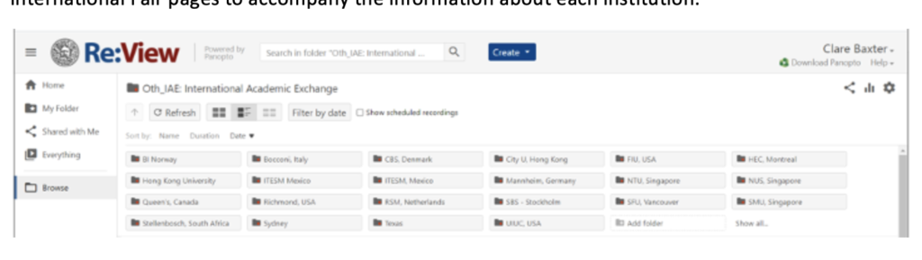
One of the important audio-visual elements to be included in the redesign was videos. Typically these were recorded remotely with students who were interviewed about their exchange experiences. These were previously spread across various folders within Re:View so instructions were provided to create sub-folders to re-organise them. They were also hyperlinked on the International Fair pages to accompany the information about each institution.
Outcomes
The Moodle redesign was a three-month process, from the initial request for help and guidance to the launch date of the new page. Throughout the redesign process, the International Relations team liaised with Clare (from TEL) about the different processes and ways to edit key features. Screen recordings of meetings and mini-tutorials were shared so that the team can revisit these in the future to work from – and to use on any other pages they may wish to update in a similar way.
Naomi Farrington, one of the International Relations Coordinators, said that the new International Academic Exchange page is ‘a visually exciting course with clear signposts throughout the Academic Exchange journey. It is now easy to update and edit’. Feedback from visitors to the page have also been complimentary, with comments such as ‘The Moodle page is loaded and highly informative. Kudos to the team, well done!’
As a result of the redesign, the team managing the three courses now have a central ‘hub’ to administer and maintain. It is now dynamic, attractive and functional. There is also only one location for students too and the new design means that it doesn’t look like other Moodle courses, as well as conveying a sense of excitement about the possibility of an exchange.
Recommendations
- The team will be working through the Blackboard Ally report and making amendments to resources where possible to make the pages as accessible as possible.
The sister Moodle page, which has a slightly different audience in that it is for incoming exchange students, will undergo a similar revamp. The International Relations team will utilise the advice and guidance from TEL during the first redesign to carry this out independently (unless they run into any unexpected problems). - As the Moodle update is rolled out this summer (2021), the International Relations team are aware that there will be more opportunities to include interactive H5P elements that could further enhance the experience for students. These features could easily be integrated at a later date.
- Finally, the new Moodle course should continue to be introduced and promoted to relevant students to ensure that the resources are utilised as much as possible.
Respond